
There was the political scandal that saw a suspicious $700 million being "donated" to the Prime Minister's account, the reshuffling of his cabinet, the firing of the Attorney-General and the election of PAC members into his cabinet that has left the investigation dead until further notice, media outlets being shut down and...a full fledged brawl about a stolen hand phone that apparently echoes racial undertones? Oh, and we are also seeing our currency drop to the lowest it's been in 16 years.
In short, the waters at home have been pretty rough.
Anyone with an accessible social media account will have seen people writing passionate posts regarding personal opinions on these matters.
As it goes, a significant proportion of the people who are your Facebook friends and whose posts will come up on your feed are likely to be in the same geographical region and of the same age group.
You might have even noticed that most of them have similar opinions of the news that has been happening recently, though some definitely less eloquently put than others.
You may have even wondered, finding yourself in a rare moment of silence or unusual thoughtfulness (in this case I am not questioning your capability for thoughtfulness, but the ability to find a moment of silence in your obviously busy important life): why does everyone seem to feel the same way? Where are the people fighting for the opposite side?
Enter Politweet: a Malaysian research firm that analyses interactions between Malaysians and their politicians through Twitter responses. They are using the huge cloud of data that only grows bigger every time some one tweets #tangkapnajib to show how Malaysian netizens are reacting to the ever stormy political climate around them. The internet is a great way to eradicate state barriers and have a binary bird's eye view of the collective opinions of the people.
We all know the faces of these batik-clad ministers, we've seen the pictures of policemen raiding the Malaysian Anti Corruption Committee and we've seen the yellow of the Bersih rally gearing up to happen, but have you ever wondered: what does a growing sphere of mistrust and criticism of a government that has ruled the country since it's independence look like?
Ladies and gentlemen, I present to you: a visual representation of how the 1MDB scandal looked like on twitter. Enjoy the beauty of big-picture data.
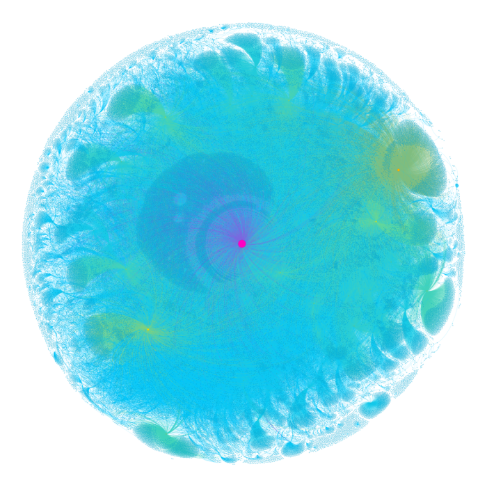
Bet you didn't expect that.
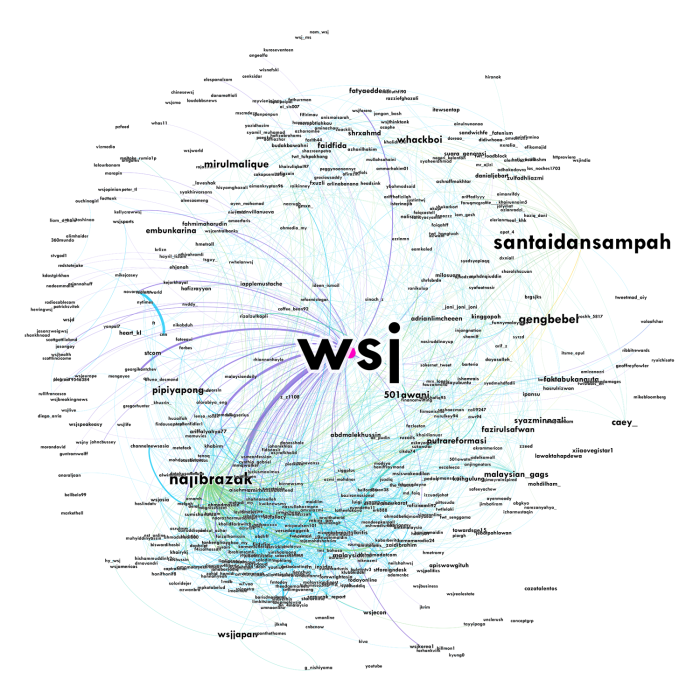
Each user is represented by a node (circle) that is coloured based on the number of their tweets that were retweeted and the number of tweets sent to them. The more attention they receive, the larger the node. Any node that retweets another node or tweets to another node is connected.
Nodes are positioned based on their connections to other nodes – strong connections pull them closer. Large nodes are considered influential within the network. We have coloured the nodes based on a scale of blue (least influential) to green; yellow; orange; red; and purple (most influential).
This is how it's broken down to the top 536 most influential users as seen below:
 | ||
To get a better sense of the scale of the Malaysia-based conversation and which users were popular locally, we can filter this graph against our database of Twitter users in Malaysia. This is what we get:
|
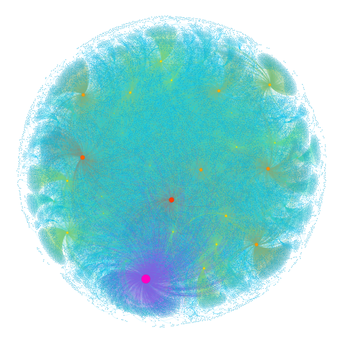
This might seem like quite a small scope that might have some bias, seeing as Twitter users are quite densely concentrated in urban city areas such as KL, but nonetheless, people underestimate how powerful the information that is available on the internet is.
If you want to see something really cool, though most of you have probably left because the only thing people hate more than graphs is people being enthusiastic about graphs, check out the analysis graph of what people were tweeting about the Low Yat Plaza incident.

This looks like it's about to be printed on a T-Shirt by an overpriced clothes brand that only uses organic cotton.
It's obvious that this graph is a lot more angular than the previous one, and probably for a multitude of reasons. I personally can't make out why Politweet has chosen straight lines to relate retweets between users in this graph but curved ones in the 1MDB graph. You can also see that the graph gets significantly less dense approaching the outer edges, which shows quite a bit of noise.
Geometrical analysis aside, this is my point (yes, I actually have one): look at how fucking cool data is. One, it is such an effective way of representing information to us human beings who seem to love our visual cues. Two...just look at how beautiful numbers can be. Numbers have got such a bad rep for being cold and steely but look and how they give us the power to manipulate them into something that I wouldn't hesitate to call art.
If you've stuck with me this far, thank you for listening (reading? Listening to the narration by the voice in your head?) to this rather nerdy exploration. Trust a physics student to take something as dramatic as a political scandal and turn it into a long blog post about data representation.
As always; stay sharp, stay safe and stay curious.
Wei Ann.


No comments:
Post a Comment